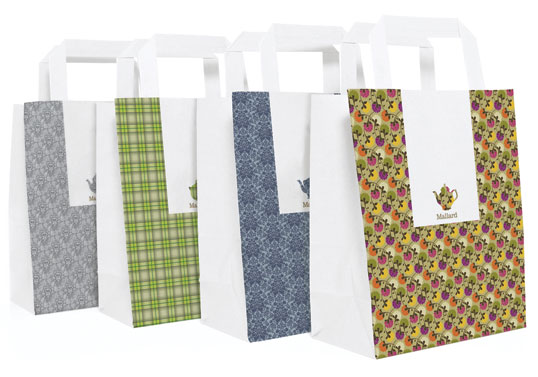
Designed by Sarah Walsh / Brahm | Country: United Kingdom
“Mallard is a specialist tea company which sells loose leaf tea through its shop and tearoom in Knutsford. The mix and match branding is inspired by the eclectic feel of the establishment which is quirky, eccentric and unmistakably English.”
Designed by Mucca Design | Country: United States
“The brand is simple: Four colours, one custom typeface, and lots of witty and original copy.”
The work for Brooklyn Fare is a full-on identity: packaging design, custom typeface, copywriting, even interior signage and t-shirts (in all it uses only four colors). The packaging "talks" to the consumer using a witty tone, playing on tired cliches, and we're especially fond of the coffee cup sleeves that poke fun at Starbucks, saying, "It's a medium not a grande" and "It's a small not a tall." Suck it Starbucks!
“The simple, environmentally friendly packaging range we developed for Cumulus Inc provides a flexible system and range of materials that can be adapted to suit the changing needs of the restaurant’s takeaway business.”
These two friends take normal things they find around the house and make them into words. I think this is a quick and easy way to make a diary or experimentation, and is something i think i should consider when i create typefaces.
I think im in love!...the new promo design has such a festive feel to it. I walked into starbucks in Borders in Leeds yesterday and there was a massive transformation! This made realise how important my coffee shop brief was...how important it is for consumers and target audiences to react and engage with the design around us.
Ive been looking at layout of type posters to influence my posters for the dont panic brief. Keeping design simple any laying it out in a way which is pleasing to the eye i think is the key for these posters to look so effective. Colour choices matter too.
A recent graduate of a BA Hons Degree in Graphic Design at The Leeds College of Art and Design. This blog contains the design briefs i have chosen to undertake, my plans for the future and also the things which are inspiring me out there in the design world.