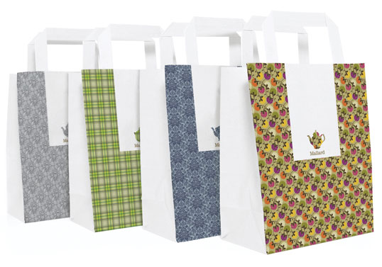
“Mallard is a specialist tea company which sells loose leaf tea through its shop and tearoom in Knutsford. The mix and match branding is inspired by the eclectic feel of the establishment which is quirky, eccentric and unmistakably English.”


Designed by Mucca Design | Country: United States
“The brand is simple: Four colours, one custom typeface, and lots of witty and original copy.”
The work for Brooklyn Fare is a full-on identity: packaging design, custom typeface, copywriting, even interior signage and t-shirts (in all it uses only four colors). The packaging "talks" to the consumer using a witty tone, playing on tired cliches, and we're especially fond of the coffee cup sleeves that poke fun at Starbucks, saying, "It's a medium not a grande" and "It's a small not a tall." Suck it Starbucks!


Brooklyn Fare from Mr. Mucca on Vimeo.
Designed by Round | Country: Australia
“The simple, environmentally friendly packaging range we developed for Cumulus Inc provides a flexible system and range of materials that can be adapted to suit the changing needs of the restaurant’s takeaway business.”


No comments:
Post a Comment