Saturday 27 February 2010

Gabriele Wilson

Ive been looking at different techniques on how patterns/designs are made as a set and what processes i could use rather than just printing then from a computer. I think these have been done by ink or possible screenprinted. The colours are vibrant and work well as a set. I don't however want my covers to look like a printed textiles person has done them!


Jenny Grigg

You can really tell that this designer, Jenny Grigg loves to experiment. With her Peter Carey book cover made from layered shapes and the type been hand made by folding and pressing paper/masking tape together to create the title. I think this gives a personal feel to the book.

The other book covers look as if they have been letter pressed with traditional type forms and layered to create very distitive book covers. Not only are the shapes of the letter forms strong and bold, she has added textures and colours to make these covers look even nicer than they already look. They have a traditional yet new feel to them as they have been photoshopped.


R.I.P Micheal Jackson By Aeiko

I love the simplicity of this poster design. It is bold and the white typography contrasts well with the black background. I want to create this type of poster when i go onto designing my promotional material for my book covers and possible the 10 things you should know about publication.

If i were a graphic designer i would probably do this


Nice processes used:

Spray-paint on painted wood

Gloss paint on concrete

Vinyl stickers on a work-bench

Varnish on natural wood

Mike Giesser


'Amsterdam based, Mike Giesser is a graphic designer who prides himself on a style formed around the process of reduction.'

The metallic spotgloss used on this leaflet works really well. The type all left alligned works well with the dates reading in words works really well. I think the choice of spot colour used on here may influence my design when i design the promo stuff for the bodyshop eg. Xmas promo or bithday gift cards.

I also like the way Geisser has wrote the dates in words. This may looks effective when i design my poster for the cardiff marthon as i could design a purely type led poster to attract people to come to the event rather than putting the obvious on the poster. eg. people running!

2008 calender design


This was designed by Jonathan Davies. Even thought this is a calender, the gradient of colours work really well. The typography on the front of the calender uses colours which related to the words. Overall i really lovely calender design, thought of properly, nice bit of promo material and i wish i got something like this through the post!

I hope to use this simple typography style when i design my publication for the 10 things you should know about.

Mouscacho 2010 Calendars


Designed By: Jasho Salazar
My initial ideas for my book cover brief is to use this layered effect.I cant work out whether this was screenprinted or digitally printed, but i do however think the different typefaces layered together works well with the colours. Even though i wouldn't be using so many colours on my book cover as things would get a bit complicated this style of design may look good in type or simple vector shapes.

Letvica™ Font


Designed by: Branko Bobic
Layered shapes with different shades of colour in the background looks effective.The typeface is contemporary and box shaped and looks a bit retro. I hope to try layering shapes for my book brief.

Typography is everything

Typography which creates an illusion to the eye may give my book covers a 3 dimensional feel. I like the way the colours are layered and placed to create this effect and the message can still be read no matter how close the type has been placed.


andre gottschalk

Andre Gottschalk created this book cover set. They were shapes layered in two colours to give this beautiful effect. They work really well together on their own and as a set. They have a contemporary feel and almost create a sort of gradient when they are all put together.


Limited Editions: MoMA Bauhaus 2010


To celebrate the current exhibition "Bauhaus 1919-1933: Workshops for Modernity", Moleskine® and MoMA have created two new limited editions: a Cahier Set and a MoMA Notebook.

The shapes on each notebook work very well together and as a set. Even though they are simple you can definitely differentiate each book by the colour and shape. To add to the promotion you get shaped stickers and a notebook which consists of all 3 shapes added on the front to bring them all together.

Thursday 25 February 2010

Typography Book

Looking at colour i think the red and white contrast each other really well. The front cover consists of typography which has been made into an image. Although it looks very technical, i feel this works really well. Simple and effective design.

Design Taste Book

This is really clever. I like the way the sleeve for the book can be folded out into a poster. Its quiet interesting how the objects on the poster are made life size which i think makes it a bit special when its layed down on the table. I think the design may have been printed on heavy matt paper/a dinner plate mat material which has been foiled and de-bossed. This is a brilliant way to promote and design something that people can keep, and something that people can place on their tables/walls to make their place look a bit unique.


http://www.victionary.com/book/design-taste_pg.html

Wednesday 24 February 2010

Book Spine Design

Even though illustration isnt a subject i am very passionate about, when i saw these i really loved them. I think the detialed black illustration been printed on the brown stock really makes these look beautiful. They also work well as a set together as they have a consistant style of illustration which runs throughout the design.
I have also learnt the spine of the book is probably the most important part of the book as well as the front cover as this is what people see first when they are browsing through books on a shelf.

Book Set


Simple, bold typography works really well with the simple illustrations here. I love the fact that the designer has really thought about the design of these books, and added the little quirky cut out bookmarks which really work well together. Ive never seen this kind of design together.

How branding is applied

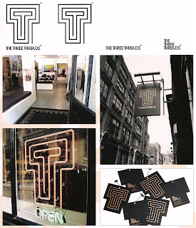
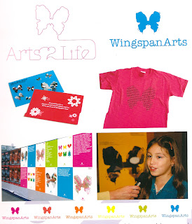
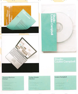
I got this really cool book out of the library called Brand Identity Now. It has loads of designs where it shows how branding is applied onto stuff. The design in there is really innovative and its really made me think that branding just doesnt need to stay on print based stuff it can go anywhere as long it works well. Below are a few examples from the book:


Inspiration for Book Cover Design


I randomly came across this when i was browsing through the internet. I thought this style of typography could be something i could create for my front cover of my HG Wells book cover design. I could vector things to do with the books title, but will this give away what the book is about? Maybe i need to think of themes to relate to the books which may make them a bit more interesting as book covers.

Cutler&Co Menus

Even though this is a menu, i thought this was a really nice, simple yet beautiful piece of design. The simplicity of it with the condensed typography gold foiled and de bossed type shows that these menu's have attention to detail.
This could be something i think about and experiment with when i think about designing my book cover.

Nike

I fell in love with this when i saw this. I think the type being on such a shiny, metallic stock works really well. The embossed typography works really well and the gold probably represents the success of the brand as nike is such a popular and recognized brand.

Pallazo Grassi

I feel the interaction of a book is imporant with the person looking at it. Even thought this is just a sleeve the audience will have to take the book out themseleves to read the book. I feel this intrigues the audience to find out what is inside.

The publication at the bottom has a sleeve which covers the booklet. This is a clever way to split up type and image.