Angel Falls is a local coffee company. 4 promotional pieces were created: a two color silk screened poster, DVD promotional packaging, volvelle wheel for a promotional mailing, and postcard. The designed pieces was chosen to mimic coffee sacks that are used to decorate the coffee house. Skills / Technology Used: Silk Screening, Adobe Illustrator & InDesign
The bold design works really well. This makes me think the stock a choose to print on is going to make a big difference to my artwork.
The starbucks cup holder is made from corrugated card. This is so the card will grip the cup. I think this is something i may need to consider for my cup holder.
Some leaflets i found when i was shopping around Leeds. I love the simplicity of them and the choice and colour of paper sock making a massive impact on them as a set. The design on the front is layed out with lovely negative space allowing the illustration and type to breathe without it getting too over complicated. Good design is definitely appreciated.
Detail for Men Detail For Men is a hairdressing salon, day spa and grooming website for men. Hanzic Design is responsible for all of Detail For Men's branding and communications, including logo design, stationery and spa menus, shop graphics, website and advertisements.
Y Salon Stephen Hanzic developed a logo and brand strategy for one of Melbourne's leading hair salons. The design was inspired by the frills and tassels of Y Salon's elaborate interior.
Here i looked at sets of promo material for coffee shops. I saw a consistency in how the logo is still kept as the main focus in whatever they apply it onto. This is something which i need to do!
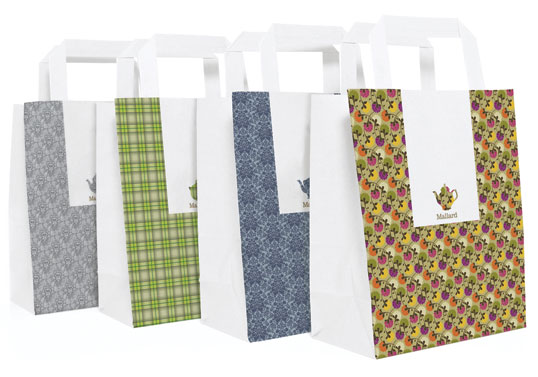
Designed by Sarah Walsh / Brahm | Country: United Kingdom
“Mallard is a specialist tea company which sells loose leaf tea through its shop and tearoom in Knutsford. The mix and match branding is inspired by the eclectic feel of the establishment which is quirky, eccentric and unmistakably English.”
Designed by Mucca Design | Country: United States
“The brand is simple: Four colours, one custom typeface, and lots of witty and original copy.”
The work for Brooklyn Fare is a full-on identity: packaging design, custom typeface, copywriting, even interior signage and t-shirts (in all it uses only four colors). The packaging "talks" to the consumer using a witty tone, playing on tired cliches, and we're especially fond of the coffee cup sleeves that poke fun at Starbucks, saying, "It's a medium not a grande" and "It's a small not a tall." Suck it Starbucks!
“The simple, environmentally friendly packaging range we developed for Cumulus Inc provides a flexible system and range of materials that can be adapted to suit the changing needs of the restaurant’s takeaway business.”
These two friends take normal things they find around the house and make them into words. I think this is a quick and easy way to make a diary or experimentation, and is something i think i should consider when i create typefaces.
A recent graduate of a BA Hons Degree in Graphic Design at The Leeds College of Art and Design. This blog contains the design briefs i have chosen to undertake, my plans for the future and also the things which are inspiring me out there in the design world.