Here are a few snaps of what the current space looks like. At the moment it is undergoing a very big make-over with the help of the interior designer!


My client gave me this brochure of the concept development of coffee republic. He really liked the consistent brand recognition throughout all their products and wanted something similar to this with his promo stuff.

Logo Concepts
Logo is very simple and consists of 2 colours which will be cheap when printing. They also have a condensed version of the logo so it can be applied onto cups, tissues etc.

Menu Boards and Promo Poster Design
Menu boards all use the black as the core colour of coffee island and different complimentary colours for the menu design. For coffee island we could have colour codes to relate to what they sell.
Promo posters are very bright and use strong photography and bright colours to sell their products.


Menu Design
Nice idea of menu being sectioned off with taller bits of paper to fold into a nice rectangualr shape menu.
Below: Menu my client picked up again, standard menu. The design above it much more creative and works well.


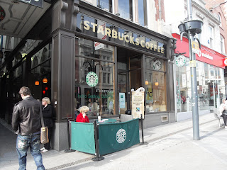
Starbucks


When doing research for the promo material for coffee shops, we didn't have much luck! Coffee shops are very specific about their design and they don't let people take photo's within their coffee shops due to copywriting. So we managed to take as many photo's as we could and did however mange to get our hands on leaflets which were distributed around the coffee shops.


Hair Salon
Here are the photo's from the Nero Salon. Our design will have to work according to this theme.


HCUK


Saks

RMUK
Yesterday me and Lauren went into town to see what kind of promotional material was already out there. We were aware that the city center may give us limited research and there were much broader research out there which we will find via. internet and use the library. It was interesting talking to staff about their promotional material and how they work within the salons and with their clients.


Price Lists attached to the door so people can pick up leaflets if salon isn't open.


Existing Promo Leaflet
This was the Kerasane booklet. Me and Lauren both loved the silver foiling on the white stock at the front of the booklet. We discussed whether this is something we want to consider when we are designing to give something like this an 'elegant' look without using lots of swirls. We also thought the high resolution photography worked really well with the typography inside the booklet. Photography is another option we could consider as using our own photography will prevent us from plagerism.


Loreal Leaflet


Exisiting Pricelist
In my opinion i think the Pricelist is quiet nice. It is printed on a nice stock and images are very strong. However i believe we could transform this and give a whole new look.


Existing Corporate Identity for Nero
These are the existing business cards or Nero hairdressing. As you can see these are a massive disappointment to compliment the salon. A new look is definitely needed! My initial ideas for the salon is to go for a elegant look to match the interior of the salon. This will all become apparent when we start researching into business card design further.
Front of Business Card

Back of the business card

Compliment Slip for Nero


No comments:
Post a Comment